
The use of color is undoubtedly an essential aspect of branding and graphic design. Think of a brand you know well enough to picture its logo. What colors does it use? What emotions do you feel when seeing that logo? I think of Nike and feel nostalgia when I think back on my first pair of Nike tennis shoes I was so excited to show off to my friends at school.
This mapping of emotions to colors is a key part of a field of study called color psychology. It focuses on how colors can impact a person’s perceptions and behavior. Accordingly, applying the right color palette helps a brand, or design, convey its message and evoke the desired emotions in its audience.
By understanding the emotions that colors can stir, you can use this in your marketing, branding, and design to appeal to your target audience.
Color and Emotions
Color influences our emotions and behavior in many ways. In an article from Platt College about the psychology of color, professionals say that every business deliberately uses colors in their branding that evoke a specific emotion in their customers or clients. Most people associate red with passion, excitement, and urgency, while blue is associated with trust, calmness, and intelligence.
Let’s take a closer look at how colors and emotions correlate.
- Red: passion, excitement, urgency, danger, love
- Orange: energy, warmth, enthusiasm, playfulness
- Yellow: optimism, happiness, caution, warning
- Green: growth, freshness, health, nature
- Blue: trust, calmness, intelligence, professionalism
- Purple: luxury, sophistication, creativity
- Black/Gray: elegance, power, sophistication, mystery
- White: purity, cleanliness, simplicity, innocence
- Brown/Beige: earthy, warm, comfortable, reliable
Of course, these associations are not universal, and cultural differences can play a role in how colors are perceived. In some cultures, white is associated with mourning, while in others it symbolizes purity.
Warm Colors
Warm colors such as red, orange, and yellow usually correlate with feelings of happiness, enthusiasm, and positivity. These colors are mostly used in the food, entertainment, safety, sports, and travel industries.
You probably have noticed these types of warm colors in logos and branding of major companies like Netflix, McDonald’s, Orange Theory Fitness, and Reese’s.
Cool Colors
Some people may relate the colors blue, purple, and green with relaxation, and professionalism, and can have a calming effect. Industries that deal with the environment, farming, non-profit, real estate, retail, technology, marketing, and finance are more likely to use these cool colors.
You can see companies like Facebook, Starbucks, Whole Foods, and P&G use cool colors in their branding and campaigns.
Neutral Colors
Because of their backdrop functionality, neutral colors like black, white, gray, and brown are often seen in graphic design. They can also spark their own meanings and messages as mentioned above.
Those in finance, luxury retail, media, and technology are more likely to use neutral colors in their branding. Well-known high-end brands like Forbes, Apple, Mercedes-Benz, and Swarovski capitalize on the luxury neutral colors exude.
Color in Branding
When it comes to branding, color is a powerful tool to create brand recognition, convey a message, and evoke emotions. A brand’s color palette is synonymous with its identity and values, and it can be used consistently across all branding elements, such as logos, websites, packaging, and marketing materials.
Some of the most iconic brands in the world have strong color associations.
Coca-Cola’s red and white logo and packaging convey a sense of excitement and passion, while Apple’s sleek white and silver products evoke sophistication and simplicity. Similar to these examples, McDonald’s golden arches are instantly recognizable and associated with happiness and playfulness.
Color in Graphic Design
In graphic design, color is used to create a visual hierarchy, convey a message, and evoke emotions. The right color palette helps a design stand out and communicate its intended message effectively. Emotions are ultimately what lead people to buy or pass on certain products.
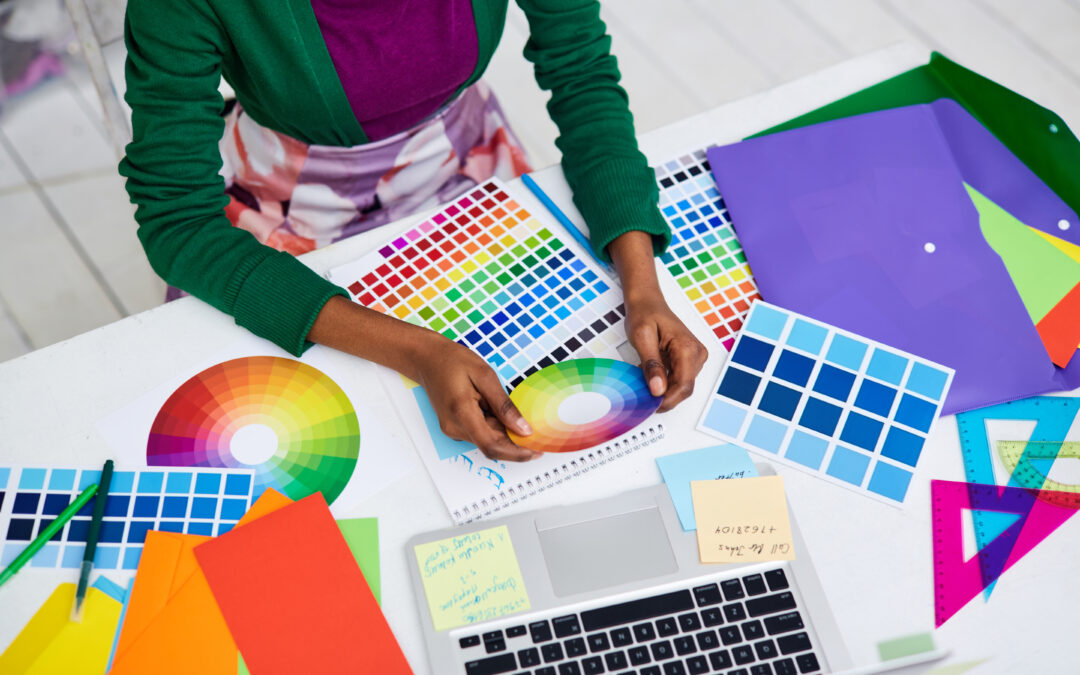
Designers often use color theory to create harmonious color schemes that are pleasing to the eye. The color wheel, which shows the relationships between primary, secondary, and tertiary colors, creates complementary, analogous, or monochromatic color schemes.
Color can create contrast, highlight important elements, and create a mood. For example, a black-and-white design can evoke a sense of sophistication and elegance, while a bold and colorful design can convey playfulness and energy. Using colors and designs to distinguish your company from others can help drive more leads to your business and help customers recognize your products and services.
Conclusion
Color is a powerful tool in branding and graphic design because it conveys a message, evokes emotions, and creates a visual impact. By understanding the psychology of color, designers and brand strategists can create effective designs that resonate with their intended audience. Generate a strong brand identity and connect with your consumers on an emotional level. Use color branding to create memorable and effective branding that stands out from your competition.