

Before we wrap up this three part series on speeding up your WordPress website highlighting mobile site speed, it’s important to highlight the key takeaways thus far: Part One, A Speedy Overview:
- Search engines, specifically Google, are now extremely dialed into how fast your site speed is and this affects how your page is ranked.
- Internet consumers are very impatient. Your website needs to be super fast and reactive to get and hold their attention in the hopes of converting them to customers.
- Most sites don’t perform optimally. This means you have a good chance to beat out your competition by making sure your website is fast.
- Like any web platform, there are pros and cons to WordPress. However, with some tricks you can beat the system and speed things up.
Part Two, The Desktop Diaries:
- To make sure your WordPress website meets key speed criteria you should start with a good foundation with a solid theme.
- Imagery is a primary factor in why load times are hindered in WordPress. Make sure your images themselves are optimized and how they are loaded is efficient.
- Think lean and minimal. Make sure unused fonts, code, and unnecessary additions are removed so they aren’t slowing things down.
Desktop Optimizations + Mobile Speed = Besties
If you’ve made it this far in our series, there’s good news. All of the changes and optimizations that you have worked hard to incorporate into your desktop version of your website have also greatly improved your mobile site speed. You have a theme that is already built with mobile functionality in mind. You’ve followed our steps to optimize and minimize your site. Therefore, your mobile load times are proportionately improved. The size of your website is virtually the same on both desktop and mobile views. Since we’ve slimmed down the website already through our initial optimizations things should be pretty speedy.
Kick It Up A Notch
Why stop there? Can’t we do more? Can’t this load faster? I thought you’d never ask. In case you didn’t know, people use their phones a lot. In fact, 46% of Americans were on their phone for 5-6 hours a day in 2021. Needless to say, making sure that your mobile website is putting its best foot forward is pivotal to business success. It is my personal opinion that when it comes to mobile websites, less is more. Your mobile WordPress site should be brisk and crisp with the key features of your business listed clearly. You want to make an impact on mobile visitors quickly and efficiently. In order to do this, I recommend taking your page speed optimization a step further by eliminating unnecessary content and re-categorizing content specific to mobile views and desktop views.
Hide the Extras. How To Maximize Mobile Impact.
Here is a simple guide to remove unnecessary or excessive content from your mobile version of your WordPress website to increase page speed.
- Comb through your content: Before you go cutting pieces of your website, make sure you take the time to go through and see what makes sense to keep and what can go. Easy things to eliminate include large hero/header images, background images, large graphics, and animated sections like carousels and sliders.
- Utilize your responsive options: WordPress themes almost always come with an easy way to hide content from the mobile version of your website. Hiding specific content on mobile devices is a great way to quickly alleviate some of the heavy lifting of page loading for mobile devices. You are essentially just turning some things off so they are not loaded or viewed by mobile visitors.
- Here’s how to do this with WPBakery
- Check how to do this with Cornerstone
- Also how to do this with Gutenburg
- You can also do this manually with CSS. Here’s a good step by step on how that would look!
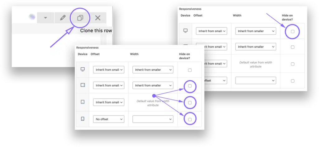
- Consider rebuilding sections in a simplified fashion for mobile devices: This is essentially an extension of number two. Rather than either keep all the content or remove all the content from a section of your website for mobile views, you can consider building out a simplified version that is only visible on mobile devices. Here’s how this would work:
- Duplicate a row, column, or section.
- Utilize your responsive tools to hide the original content section on mobile devices.
- Retool and rework the duplicated section to be simplified for mobile users.
- Utilize your response tools to hide the duplicated/new content section on desktop and laptop computers. *Illustrated Below in WPBakery
To Wrap It Up
Page speed is critical to your business success, including your mobile site speed. By having a slow website, you are losing a huge portion of your web traffic. The repercussions of this are equivalent to decreased customer conversions and therefore sales. While the standards for page speed are pretty particular, there are some things you can do in-house to speed things up. As we know, WordPress sites have come a long way and theme builders work diligently to make sure your site is set up for quick load times and real-time reactivity. Unfortunately, no system is perfect and there is always room for improvement. If you’ve learned anything from our series on WordPress speed, I hope it is this: utilize the tools available, think lean, and continually improve. Want us to handle making things speedy for you? Talk to Glass Ivy now.