As we enter into the new year everyone gets to retire last year’s date and familiarize themselves with a fresh number. We say goodbye to 22 and hello to 23 (and repeatedly get the dates wrong when writing on documents for the next several weeks). During the first few times we wrote the 23 abbreviation instead of the 22 abbreviation, we noticed that it was a little more visually pleasing. Was it just something new, better handwriting for the number ‘3’, or was there something at play with design psychology impacting the preference? We decided to take a closer look at how design psychology and preference impacts the perception of numbers and patterns. Specifically, how designing with the number “23” will be more impactful and more exciting than designing with “22”.
We decided to investigate the following:
- A deep dive into the psychology of numbers and how it intersects with the psychology of design
- How the number 2 holds up against the number 3 and how 22 compares to 23
- How these two numbers relate to the 7 principles of Art & Design

Popularity Contest – The World’s Second Favorite Number
In 2014, Alex Bellos, a British writer, broadcaster and mathematics communicator conducted a survey to determine the world’s most popular number. In the global online survey Bellos asked approximately 44,000 people what their favorite number was. To summarize, odd numbers were particularly popular with a 60% preference. The clear winner was “lucky number 7” with about 10% of all participants choosing it as their favorite.
Relevant for us though, number 3 came in as a strong second place choice with 7.5% of all participants choosing it as their favorite number. Some of the speculated reasons for 3 being popular include the allure of odd numbers, emotional connotations, and relevance in religion, culture, folklore, and daily life. Bellos also stated that the reasons people said they liked 3 best is because “It’s curly, but not pretentious curly like eight” and because in Chinese, “3 means alive.”
A second smaller study on the UX Collective conducted by Atishay Goyal asked 185 people of various demographics and backgrounds their favorite number 1-10. Again 3 came in second place behind 7 with 24% of participants choosing 3 as their favorite.
Score
23: 1 22: 0

Odd vs. Even – Give ‘em Something To Think About
When considering odd versus even numbers in general life, there are certain connotations to consider. For example, “odd” not only means different in the mathematical sense that it is not evenly divisible by two but in a literary sense it means unusual, unique, or strange. “Even” on the other hand is comparable in a literary sense to ideas like smooth, steady, or flat. In a 2010 Psychological Report published by Terrence M Hines, coined “The Odd Effect”, evaluates this duality in meaning and how it impacts how people view numbers.
To summarize the study “it takes our brains longer to process odd numbers. They are literally more thought-provoking”.
Score
23: 2 22: 0

Numbers in Marketing & Branding
Anytime you are designing and creating content for marketing or branding purposes you want to create something that builds brand trust and expertly engages your audience. One way to make sure you are hitting the mark is by incorporating psychology into your marketing method. The crossover of psychology and marketing has become a popular tool over the past decade. As the understanding of how marketing influences consumer behavior evolves, professionals can introduce new tools, directions, and data into making their efforts more effective.
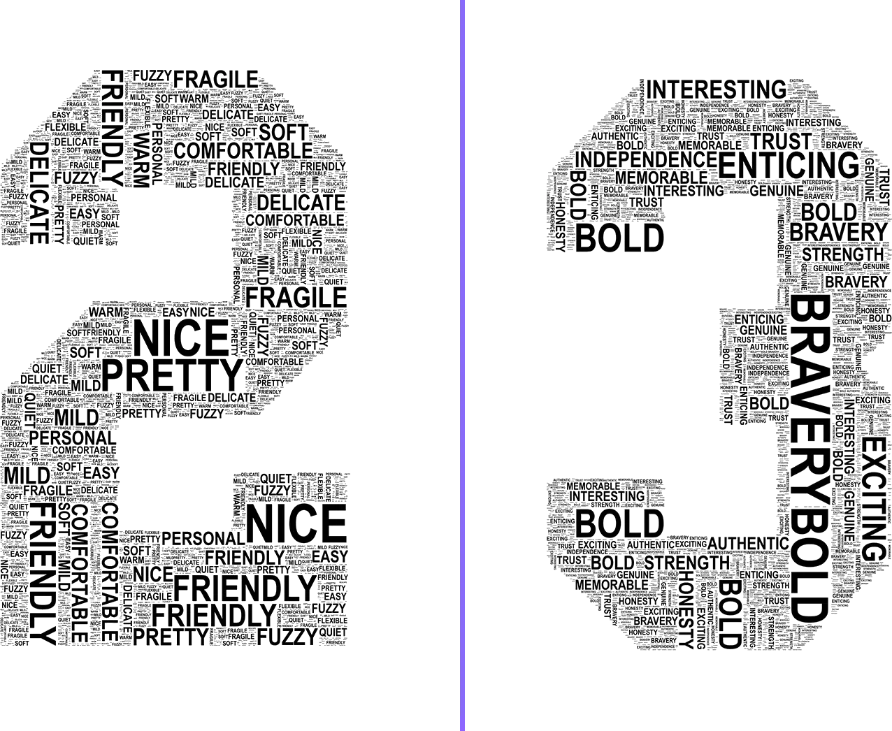
Dating back to the era of Pythagoras theorems and mathematics, odd numbers, specifically 1, have been viewed as masculine. Even numbers, specifically 2, have been viewed as feminine. While this may seem an abstract concept, you theoretically could leverage feminine stereotypes such as “pretty, fragile, personal, friendly, quiet, flexible, comforting” into your marketing through even numbers if that speaks to your brand message. Alternatively, you could incorporate odd numbers if you want to illustrate masculine stereotypes like “independence, strength, bravery, and honesty”.
Other marketing professionals and psychologists have evaluated the emotional connotations of different numbers. Some of the key takeaways for our purposes of how numbers are tied to emotions and feelings include:
- Odd numbers provoke a sense of trust and authenticity
- Even numbers create symmetry and comfort
- Odd numbers create interest and are easier to remember
In short, 22 vs 23 in marketing, branding, and design has the potential to evoke different emotions and connotations from your audience. Depending on what your goals are, one could have a higher impact than the other.
Score (this one’s a draw)
23: 3 22: 1
The Principles of Art & Design
The principles of art represent how an artist or designer utilizes the elements of art to create a specific effect and help convey the designer’s intent. The 7 principles of art and design are: Contrast, Emphasis, Pattern, Repetition, Movement, Space, and Balance. Principles of art and design focus on how an artist puts elements together rather than the elements themselves. When considering 22 vs. 23 we will consider the principles of balance and repetition.
When thinking about balance, and how it is achieved, we can break it down into symmetry, asymmetry, and radial symmetry. 22 would be symmetrical since it’s the same element in the same position side by side. Symmetry provides a sense of stability to the viewer. 23 on the other hand could be considered asymmetrical balance since it’s two different elements taking up the same amount of space. Asymmetrical balance is a bit more imprecise but thought provoking.
Repetition as a design principle can refer to any element in the piece such as shapes, colors, lines, etc. In design, repetition is typically used to make something predictable and consistent. Therefore, 22 could be considered “predictable” or “safe” by design standards whereas 23 would be “edgy” or “exciting”.
Score
23: 4 22: 1
Less Psychological, More Design Preference
Psychology in design and art is a vast study with lots of data, insight, and research. However, as is often the case with graphic design and marketing, it boils down to your preference. Not only your preference as a marketing professional or designer, but also your preference for how you want to be perceived by your audience.
There’s very clearly nothing wrong with the number 22. We incorporated it into design and copy for a full year just fine. However, as we’ve discovered, 22 in relation to how it is viewed as a number and a design element is overall bland. It’s safe, comfortable, soft, repetitive and quaint. All of these things usually do not make a large impact. They are not in your face, they are not enticing or making a statement.
23 on the other hand, is something new and exciting. It’s literally thought provoking. It makes people stop and consider and observe. 23 is more memorable and unique. As a marketing agency, we are always eager to capture the attention of an audience and design something that is going to have the most impact. For that reason, we are looking forward to the Year of Designing with 23.

